This web page was produced as an assignment for a course on
Statistical Analysis on Microarray Data at
I used limma to compare normal versus tumor tissue stuff. I did not just use an earlier comparison for this part because I wanted to make sure that I could use as much data as possible since many of genes have at least one array in which the spot had to be thrown out. Since everything is in one of these two categories, all 34 arrays are used rather than just the several that would correspond to comparisons like ERMS vs PRMS.
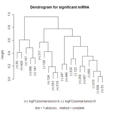
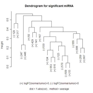
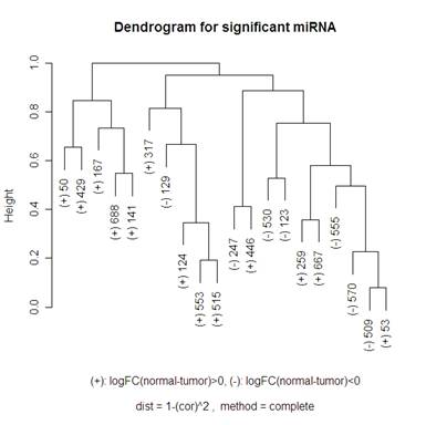
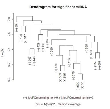
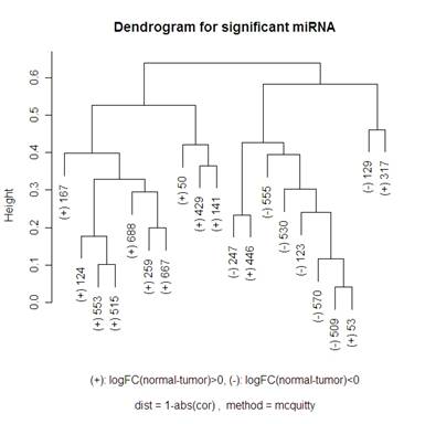
Here is a volcano plot comparing the miRNA to see which are significant at differentiating normal and tumor tissue. I will be looking at the 20 most significant genes to see how they are related – this corresponds to the ones above the horizontal grey line. The vertical grey line is at 0: 7 of the 20 genes had a negative fold change, 13 had a positive one. So I am hoping that clustering methods that I use will break up these significant genes into those two groups. When talking about the miRNA, I am going to use “significant” and “differentially expressed” interchangeably.

To measure the distance between two miRNA x and y, I tried two different methods: 1-abs(cor(x,y)) and 1-(cor(x,y)^2)
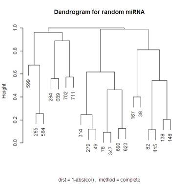
For the hierarchical clustering, I had the choice of: "ward", "single", "complete", "average", "mcquitty", "median" or "centroid" in R. The graphs below compare complete and average.
|
|
|
|
|
|
Looking at the other options, it seems as though Mcquitty 1-abs(cor(x,y)) (shown below) actually does the best job of separating the up and down regulated miRNA, but I don’t know what Mcquitty’s measure of distances is. As you can see below, there are only 3 miRNA that got put into the incorrect cluster (the left half is all + and the right half is 7 - and 3 +). It isn’t necessarily a bad thing to have up and down regulating miRNA in the same cluster though because there might be some closely related miRNA that are inversely related. For example, look at miRNA 509 and 53 on the dendrograms above. These seem to be very closely related in every single clustering. The reason that I like the Mcquitty dendrogram though is that it looks like the clusters aren’t just adding a new single miRNA to the cluster at each step, but instead there are distinct clusters forming.
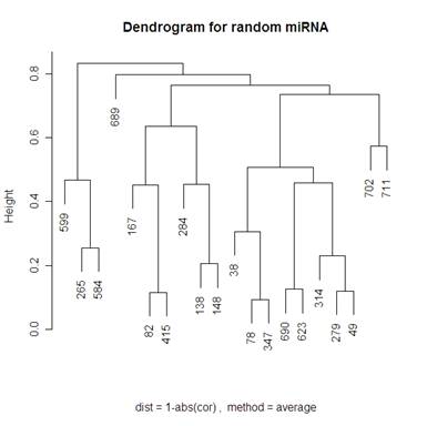
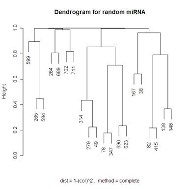
Looking at 20 random genes, we should expect to not see any obvious clustering. The dendrograms below do not have any obvious clustering which is what we expect.
|
|
|
|
|
|
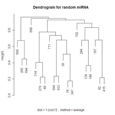
Because I included the dendrogram with Mcquitty’s distance measure I have included the same dendrogram on random genes below.
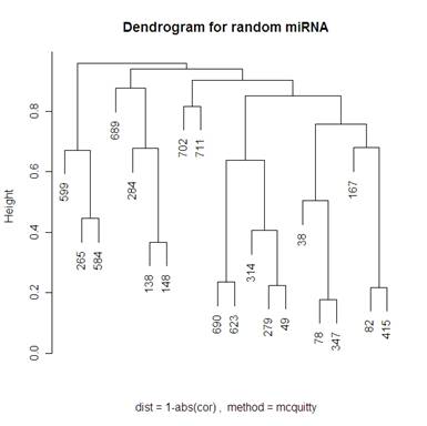
Keeping “average” or “complete” method constant, there were more changes in the dendrograms of the “average” method when switching the distance metric that I used (1-abs(cor(x,y)) and 1-(cor(x,y))^2). When looking at the “complete” method (the left side of the 2x2 tables of dendrograms above) it looks like the only change in the dendrogram is the scale at which any two clusters meet. Looking at the “average” method (the right side of the 2x2 tables of dendrograms above), the clusters themselves are different between the two types of distances. Note that the distance 1-cor^2 < 1-abs(cor) for any correlation since cor is bounded by [-1,1]. This explains why the distances are all smaller for the 1-abs(cor) distance measure dendrograms.
I did not include any of the “simple” method clustering because there were strings of gene relatedness instead of clusters where the two closest miRNA were clustered together, then the next closest miRNA would join that cluster, and the next closest would then join until the final two clusters were of size 19 and 1. The “average” method did this a little bit where on the highest branch of the tree there is one cluster of 1 or 2 and then the other is of size 19 or 18. The “complete” method did a good job of defining clusters rather than allowing strings of miRNA to occur, but it didn’t do a great job of distinguishing between the up and down regulating miRNA (look at the (+) and (-) on the labels of the gene names). The Mcquitty method (below the 2x2 tables that are above) did a good job of distinguishing between the different up and down regulating miRNA.
A noticeable difference between the miRNA that were significant in distinguishing between the normal and tumor tissue and the random miRNA was that there seemed to be more strings of connectedness between the significant miRNA than in the random ones. Another interesting difference is that in the “average” method the distances for the significant miRNA are a lot smaller than for the random miRNA (this is even more the case using the “single” method – not shown). For the “complete” method, in the random miRNA, there are a lot of clusters that are not connected until the distance is nearly 1 (which is the maximum distance in both measures of distance that I used). This is not so much the case with significant miRNA.
I have reprinted the significant miRNA dendrogram with 1-abs(cor) “Mcquitty” method below to talk about it in further detail.
This graphic demonstrates how clusters of miRNA are related. For example, it looks like there are either two clusters that are about a distance of .65 from each other, or you can see 4 clusters (the leftmost 7 miRNA, the next 3, the next 8, and the rightmost 2). The lower the horizontal line is that connects two clusters (remember, a single miRNA can be a cluster by itself), the more related the two clusters are. For example, miRNA 509 and 53 are very closely related, 553 and 515 are also very closely related. But the distance between 509 and 553 is the first horizontal line that connects them – so this distance between clusters that include those two miRNA is about .65.
This website was designed by Austen Head.
Email: austen
[dot] head [at]